Pacific Campaign House partnered with ASPIRE PAC to develop a new brand identity, including a new logo, design system, and website.
ASPIRE PAC
Asian Americans & Pacific Islanders Rising & Empowering (ASPIRE) PAC is the political arm of the Democratic Asian American, Native Hawaiian, and Pacific Islander (AA & NH/PI) members of Congress.
the brief
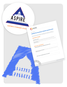
Despite its important mission, ASPIRE PAC has faced some branding challenges that made it difficult to achieve its goals effectively. Launched in 2011, ASPIRE PAC initially used a minimal brand identity featuring a functional but outdated logo in the classic Democratic blue color palette. The organization’s existing branding failed to represent the forward-looking nature of ASPIRE’s mission, both by failing to be digital-friendly and the overall dated aesthetic. And as the official campaign arm of AANHPIs in Congress, their original brand struggled to convey the necessary authority and trust.
With this in mind, ASPIRE PAC sought a brand renovation that not only mirrored the organization’s trusted role within the Democratic Party apparatus but also revitalized the brand with a unique and contemporary taste reflective of its mission.
the process
We began this project by conducting a thorough discovery phase, including market research, competitor analysis, stakeholder interviews, and a review of the existing brand assets.
Through this discovery process, we identified several key insights and opportunities for ASPIRE PAC’s brand based on the various pain points of the existing brand and logo. We also looked to the organization’s values, mission, and audiences to inform our overall aesthetic direction and tone of the brand refresh.
Based on these learnings, we developed a brand strategy that centered on the organization’s core values and mission, with a focus on highlighting the diversity and complexity of the AAPI community. We then presented the client with a few logo concepts to choose from. After a careful deliberation process, the client selected the concept that felt most in line with the organization’s identity.
![]()
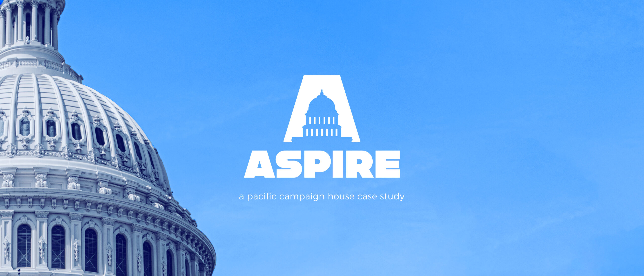
the logo
The new brand pairs a Capitol building silhouette with a modern sans-serif wordmark to evoke both the formal and progressive values of the organization. Instantly recognizable as political, this brand echoes the structured imagery of the current logo but with a central contemporary twist. The concept instantly evokes trust, political expertise, and authority.
The logo icon uses the triangle of ASPIRE’s current logo reimagined in the shape of the letter ‘A’ to represent the Asian American community that ASPIRE PAC works to empower and elevate. As representation lies at the heart of ASPIRE’s mission, the cutout of the Capitol building within the ‘A’ nods to the critical nature of ASPIRE’s work. This timeless and classic brand will successfully reflect the organization’s mission to advocate for AAPI candidates and the community at large for many years to come.
fonts and colors
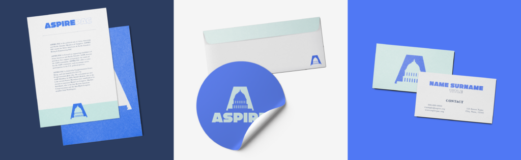
The typography features a bold and contemporary sans-serif font that grabs attention. The wordmark’s primary font adds a confident and iconic style to the brand and nods to both a retro and modern vision. This font has a big personality that stands out among more traditional political branding and will establish brand recall in the long term. To offset the playfulness of this font, we added a formal serif font to the brand that exudes both confidence and authority.
The color palette for this concept incorporates various shades of blue to signify political affiliation, while also highlighting the organization’s commitment to civic engagement and community involvement.
Overall, this logo concept captures the spirit and purpose of ASPIRE PAC and will serve as a strong visual representation for the organization as it works to increase Asian American representation in the House of Representatives.
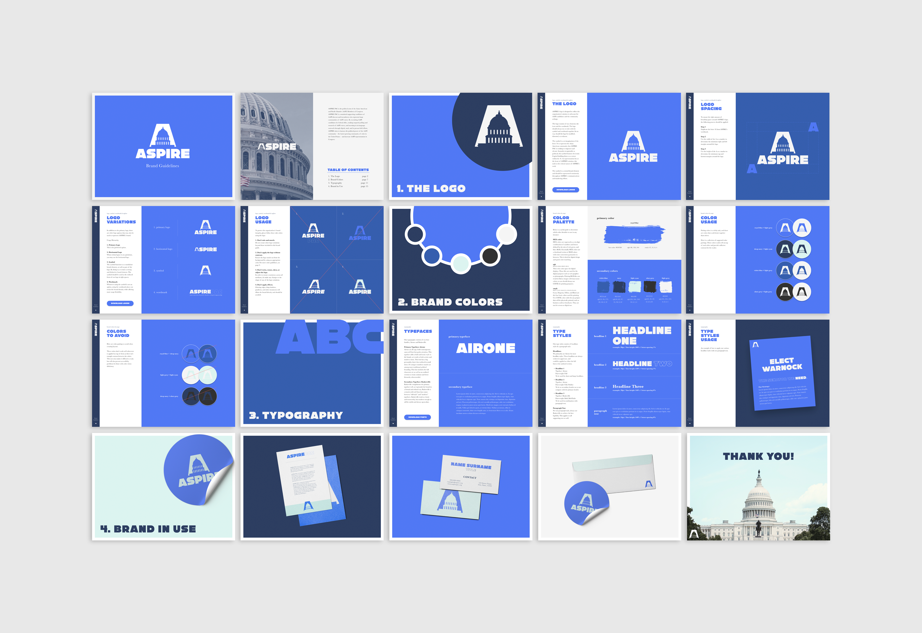
To ensure consistency and effectiveness across all touchpoints, we developed detailed brand guidelines that provide clear instructions on how to use the new branding elements and messaging. We also worked closely with the ASPIRE PAC team to train them on the new brand and provide support as they implemented the new branding across various touchpoints.
the results
The final delivery of the new ASPIRE PAC brand was a success, with positive feedback from key stakeholders. The refreshed brand better communicated the organization’s values and mission, while also reflecting the diversity and complexity of the AAPI community. The new branding elements and messaging are easily applicable across all touchpoints and will provide a more cohesive and effective brand identity moving forward.
We’re excited for ASPIRE PAC to leverage this new brand identity for years to come!